Sunday, May 27, 2012

25. Dream team

Being a college student has its ups and downs. Yes, I occasionally have the time to spend with friends or pursue some leisure activities, and I can soak up as much information as four years and however many credits will allow me to. But I'm kind of short on cash. Always. Someday, when the bright sun that is my future career crests the horizon in a glorious dawn of opportunity and the money trees finally start growing, I'm going to buy a couple things. Hopefully I'll be able to have a space to work in that doesn't also house my bed, entire wardrobe, and every other worldly possession I own. Here are some things that I would really like.

  • An IPS (In-Plane Switching) lcd monitor - A bit pricey, IPS panels have a much greater viewing angle than other monitors, allowing for an accurate view regardless of angle and they are also better at reproducing colors correctly. Believe it or not, the monitor you're currently using may not be showing you the truth when it comes to color. These monitors are pricey and would likely need to be adjusted using a color calibrator, but are a requirement when creating something that will be viewed across mediums. CNET reviews here.
  • I don't have a specific desk in mind, but I need something much better than I have now. Ideally it would have space for two monitors, various input devices, and ample storage. Being able to adjust my space as I work on a project is a requirement and my the two tiny desks I have currently just don't fit the bill.
  • A graphics tablet. While they're pricey, they greatly increase accuracy and productivity when working with the various applications of the Adobe Creative Suite. I currently have a small tablet and it's amazingly how much quicker some tasks can be finished compared to using a mouse. High end models allows all sorts of input and allow for programming buttons on the fly to evolve to your needs. The lovely online store Newegg sells them.
  • If I'm going to be sitting for hours at a time, I'm going to need a chair. Not just any chair, an absolutely great chair. The Aeron, by Herman Miller is supposed to be the pinnacle of sitting technology.

Welcome to the future.

24. Choose your battles

I understand the need to deter the public from doing drugs; they can seriously mess peoples lives up. But I think that the approach taken needs to be considered. For a good message, one that has probably scared the living crap out of anyone who's viewed it, here's a video directed by the acclaimed Darren Aronofsky.

It's disturbing and frightening and hopefully rather effective. The video doesn't need to be glitzy or actually anything special, I doubt a director of such high quality was even need for a such a video. But the key thing is that it works by depicting an actual even that could happen.

Now here is something that is the complete opposite.


I'm not exactly sure whether the girl is supposed to be drunk, stoned out of her mind or on some random other drug. Regardless, the message could have had more meaning if it used different images. Personally I wouldn't want to be drawn on, but there are college kids who would think that their friends are genius for such a prank. It trivializes the dangers that can actually come from being passed out around strangers. Maybe the not-so-subtle hand of a director like Aronofsky is what the Above the Influence campaign needs.

23. Tugging on heart strings

People are emotional creatures, and sometimes it can be advantageous to exploit that or, in less terms that make me sound like less of a horrible person, create something with them. In Google's 2011 ad for their browser, Chrome, they tell an emotional story.
It's not a long story, or a complicated story, and no doubt it's a story that's been told before, but it just works so damn well. Instead of having the story narrated, it allows the viewer to read the words in their head, contextualizing the message, as if Sophie was their own, regardless of the fact we see her father on the screen. The music is fitting for the video, at once uplifting but also slightly dramatic. I also liked the fact that everything takes place in Chrome but still manages to feel alive by showing actual onscreen actions.

And obviously I'm not the only one that feels that this is a great commercial, it currently has over five million views with only 500 dislikes compared to the 21,000+ likes. 

Chrome is really awesome by the way, just saying.

22. Walking the line

As mentioned before with Calvin Klein, sometimes ads can go a bit too far. While C&K may cross boundaries with their saucy attempts to sell the clothing that is perpetually falling off of their models, other companies straddle the line between inappropriate and genius.
I can't help but think that all Calvin Klein ads
 are shot in a humid jungle somewhere.
But from what I've during my time glossing over ads in their various incarnations, it's often the implication of something considered inappropriate that people find memorable. There are many ads that receive negative attention because they try to sell sex in a manner that is just too blatant. Everyone understands that companies can hire attractive models in an attempt to sell their product with the alluring form of the human figure. A couple of the ads below may seem a bit crude, but they can take a second to figure out and understand the joke and our brains make a little connection between this attempt at wit and a product.

Even when an ad seems inappropriate it can still relay a relevant and completely correct message. Such as the older Imodium ad that plays on what could be a disgusting situation, or the very possible depiction of what could happen if a child were to see one of the horrors of the internet.

So, basically, ads should say something, not just be something.

21. The things around us

Those of us that are students of the advertising program at the University of Oregon and elsewhere may think of brand identity and the commercial communication more than others, but in my case I rarely think of the items that I use on a frequent basis. So I decided to take a look at the brands that I surround myself with and see what their true message is compared to my interpretation.

Logitech (G9 gaming mouse, G15 gaming keyboard, x-230 multimedia speakers.)
  • I chose these products because I know that Logitech produces devices that are precise, can take a beating, and last for ages. Both the mouse and keyboard are somewhat customizable so I can make them fit my computer using needs, regardless of the scenario.
  • Logitech considers its focus to be on style, innovation and quality personal peripherals. It's exactly those factors that influenced my decision to purchase their products.

It's been like a friend to me all these years.
Levi's
  • I've worn several different brands of jean through the years, but really, none of them fit as well, or last as long, as a pair of Levi's. They're the perfect combination of quality construction and design that fit, plus they don't cost a ridiculous amount.
  • Levi's values empathy, originality, integrity and courage. It's these values that result in new products that satisfy customers and allow for the company to remain a leader in the field. Having great employees and methods of running a brand result in a great product everyone can love.
Vans 
  • The Vans that I wear never last that long, but honestly I don't mind. They're always comfortable, just as cheap as their competitors, and do a great job on a longboard or skateboard. Yes, they might normally have holes in them after a single year, but I know that trashing them is inevitable and that I'll always be able to find a new pair I like.
  • Vans promotes uniqueness and involvement with the action sports lifestyle. It's their desire to provide what customers desired that made them so successful. Whatever unique qualities someone desires from a shoe, they're sure to find it.

20. Resources

Not everyone that goes into advertising is hoping to be majorly creative, but I hope to at least have some aspect of my career be so and I know that many other want to be art directors or graphic designers. During a visit to Powell's Books this weekend I wrote down a few titles that caught my eye and decided that it would make a great post to share. So here are a few books that might be worth checking out.
  • Designing Brand Identiy by Alina Wheeler - Some reviewers say that this should be the Bible for those involved with brands and advertising. The book covers many elements of creating a successful brand identity, utilizing case studies, examples and illustrations to make the process come alive.
  • Thinking With Type by Ellen Lupton - A book I've seen recommended over and over, thinking with type covers the theory of using type to visually communicate. While it's said that anyone familiar with type or already working in the field would find this a regurgitation of facts they already know, it's likely a good thing for a student to have close at hand.
  • LOGO Design by Julius Widemann - For anyone interested in creating brand symbols, LOGO Design offers examples from around the world and in every category. Besides a seemingly endless sea of examples, the book also has case studies for seeing how logos are developed.
  • The Elements of Typographic Styles  by Robert Bringhurst - I bought this a while back as it is the suggested book for those beginning to show an interest in typography. I may not have finished it, but the book is worth purchasing. It covers the history, terms and styles associated with type and the design elements that you'll need to use type in a successful manner. Another great thing is that Bringhurst is also a poet, which reflects in the book and makes it extremely easy to dive into.
Okay, I realize most of these are about type, but here's one more.
  • The Encylopedia of Typefaces by Jasper, Berry & Johnson - Yes, it is just an extremely thick volume detailing a massive number of typefaces. But who doesn't want to have a quick and easy way to find an appropriate font? Plus, I could just look at all those letters for hours.

19. Consumer Abuse

Nope, the title of this post is not in reference to the act of abusing consumer but consumers abusing the power they have with a brand or product.
You don't need a suit to be a jerk.
The internet is amazing, I don't care what other people say, and it has given people the opportunity to be heard when they previously could not. Many websites, especially those that sell products to a large number of consumers, allows items to be reviewed for quality so potential customers know what they're getting into. 

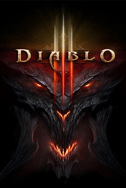
Now, I know that with any system there is often a chance of abuse, and goofy or ridiculous reviews for products go back many years. But a recent trend has arisen, especially for movies and games, where the reviews are just completely ridiculous. The two best examples are those that have happened in the last couple of months with the games Mass Effect 3 and Diablo 3. Both games had some issues that could have been resolved had they been delayed or tested just a little more. Mass Effect 3 failed to allow players to import the face of the character they have spent countless hours beating the previous games with, and it also had an ending that left some players wanting more. Diablo 3 had, and likely still does, some connectivity issues related to digital rights management that requires a constant internet connection. Beside those flaws, the game's designs and gameplay were outstanding.

Apparently, having 95 percent of a game be outstanding is no longer enough. Reviews given by customers online score both games at a four out of possible ten points, far below a failing grade. It's understandable to knock a few points of for features that are lacking, but to mark the game a zero while still maintaining it was a fun experience is completely illogical. Potential players seeing these scores are likely to balk at the idea of purchasing a product that is seemingly hated, and this does not help fix the problem. I may not have the solution to the problem, but a method needs to be established for setting up a firm dialogue between developers and gamers.
Not actually the devil.

17. Reuse

The other day I read and article which described how brands need to better utilize social media in order to make a connection with their customers. An example was given comparing the promotion done for Stanfield's underwear by Toronto advertising agency John St. to that of the Flo character that appears in ads for automotive insurance company Progressive. Instead of integrating Flo with the Progressive Facebook page, the character has her own page with four million likes, which vastly outnumbers the Progressive page that only has forty thousand.
Proof you don't have to be likable to be popular.
According to the video about the work done by John St., Stanfield's was relatively unknown on the web as a brand. John St. decided to change this. As shown in the video the promotion involved a survivor of testicular cancer staying at home for 25 days to promote the brand and raise awareness of testicular cancer. While the idea itself may be great, another great aspect is that the guy was not given his own page. So now all of those people who decided to "like" the Facebook page for The Guy At Home In His Underwear promotion are fans of Standfield's now that the campaign has ended.
The bonus is that there wasn't any "like this to support cancer," likes truly equaled donations to a charity. Great Work.


Friday, May 25, 2012

16. Not that great


No matter how hard some try to avoid doing so, everyone eventually makes mistakes. And it goes without saying that even big names and those working for them are going to flub something, rare though it may be. So in an effort to learn from others failings I thought it may be a good idea to scour through the dusty remains of history to bring out some of the worst brand and marketing choices that have been made in recent history.

  • Calvin and Klein. There are times that it almost seems that the main focal point of advertising for Calvin and Klein is the shock value of their ads. The two best, and notorious, examples are those that try to sell sex in a manner that just ends up pushing boundaries a little too far. The first ad was from 1995 and was shot in a style that was a bit too reminiscient of underage pornography. While the second, a print ad, showcased what appeared to be semi-clothed teens. Another "great" one from C&K is a ad appearing to depict a rape.
  • While the ad for Carl's Jr. starring Paris Hilton may not be on every list of horrible ads, I included for the sheer number of times I've heard people say something about it when talking about commercials they hate. I believe that the reason most people dislike the ad is because Paris Hilton had already been grinding on their nerves, and the commercial doesn't even mention what it's for until the very last seconds of the spot.

  • The idea of being able to turn anything you touch into Skittles at first sounds amazing, but it has its drawbacks. The Skittles Midas touch commercial explores this and, frankly, leaves me not wanting a candy I normally love. It's depressing and completely the opposite of the message that Skittles normally sends out.
These are only three examples, but from what I've seen of the worst ads, they depict the three biggest problems that make advertisements bad. 
  1. Stepping out of bounds by using a concept that is inappropriate or shocking.
  2. Not conveying a message that actually relates to the brand or product.
  3. Using images that are the opposite of the qualities your brands possesses.

15. Evolution

As the times change so do the ideals of society in general. A brand has an obligation to make a connection with people using shared values and needs to stay current to do so. So how do the times change how a brand looks and is perceived? Well, why not find out by looking a couple different examples.

Kodak - Originally the logo was designed after the letters forming Eastman Kodak Company, the name when the company started out headed by George Eastman. It then evolved into a simpler Kodak, that only changed slightly through the years, keeping the red and yellow and changing from the older serif to clean, new sans-serif.


General Electric - In all reality, the GE logo has not changed in any significant way since 1900. The width of borders have changed and the fill color, but the shaped letters have remained mostly the same. The largest change was between in 1900 when the GE was encased and altered to be more understandable.

Mercedes - The three-pointed star at the heart of Mercedes-Benz is supposed to represent domination of land, sea, and air. While it has remained mostly present throughout the history of the company, the logo itself has changed and drawn inspiration from history. The current design of the triple-pointed star in a circle in supposed to represent the strength of the brand.

KFC - Kentucky Fried Chicken has always had the ever present face of Harland Sanders alongside its name. As the logo has been redesigned several times, the Colonel has become a happier, more welcoming image than in the past, adding an apron to his more cartoonish figure.

14. Letters and symbols

The design that goes into a brand is rather important and will obviously incorporate letters or symbols in the majority of cases. All font families have a specific look and feel that they communicate and their message can even change if changed from bold to italics. So what do certain typefaces communicate and how can they change a message received by a consumer?

  • Dole has a simple design consisting of a red sans-serif with colors that seem fresh and a sunburst that relates to their product.

  • The current Absolut Vodka design was created by TBWA and uses what appears to be a bold sans-serif while the rest of the copy is in dark cursive figures, which really draws the eye to "Absolut" which is color coded for flavor


  • Adidas has a nice lowercase sans-serif in all black which ties the whole thing together. The triangle-like logo represents a mountain and the rugged, adventurous life that Adidas encourages.

  • Campell's has a sloped sans-serif which has been a part of the long running tradition of soup that has established it as an icon everyone recognizes.

So it appears that it may be a bit more popular to currently use sans-serif fonts that call attention to their names. Older designs, such as cursive like figure or serif fonts seem to be related to products that have been around for a longer period of time and have history to their name.

Tuesday, May 22, 2012

13. A special treat

I was poking around the internet the other day and came upon a rather natural occurrence for those parts, namely a cat video. However, this cat video struck my fancy a bit more than usual as I discovered that it was created by the advertising firm John St., an agency located in Toronto, Ontario.

This may have been posted back in November and likely talked about by many of my classmates, but I'd still like to put my two cents in.

The thing I like most about this video is that John St. decided to not to have it star an actual cat in an attempt to exploit internet culture. The agency shows that they understand videos starring cats and other cute animals have a large following on the web, but at the same time this obsession with all things cat related is a bit absurd.
Not pictured: serious business.
Creating such a video allows the public to see what kind of people work at the agency and assures us that they're not just a group of robots churning out work for big accounts. Having the video seem like a serious reveal of a new business method is entertaining without the dull non-humor of lolcats or the bubbly cuteness of most cat videos.

A++ Would watch again.

12. Around town

People get hungry. A university campus invariably has a large number of people. So it goes without saying that the immediate area around a college campus is a prime location to have restaurants. In the name of doing something fun with my time I decided I would evaluate the logos of some popular eateries near the University of Oregon.
Like poor, hungry zombies.

Cafe Yumm! - Regardless of the fact that I love the place, Cafe Yumm! does a great job of just being itself. Its  red and gold logo, depicting a steaming bowl of food, reflects the warm and inviting atmosphere that can be found inside the restaurant.
Bonus points for having a logo that's so happy.
Sy's New York Pizza - While the website and logo for Sy's may seem a little dated, I honestly think it matches the character one conjures up when thinking of New York pizza. Sy's has been in the same location since 1978, and it feels like the near permanent fixture that it is.

Ron's Island Grill - I like the food, but the sign for Ron's doesn't appeal to me in any way, although it is better than the website that appears to be a remnant from the late 90s.

I always get this weird feeling I'm going to
 run into Magnum, P.I. era Tom Selleck.


Yogurt Extreme - Of the three establishments near campus that serve frozen yogurt, this one stands out solely for the promises made by such a name. While there may be many toppings to choose from, all the word "extreme" does is remind me of the design choices seen on the inside.

11. Condescension

Closely related to the questionable practices and methods used to advertise Ubisoft's new game, I've decided to briefly talk about something find happening all to often in advertising, regardless of medium. That being a condescending tone or message relayed to the target audience. I find that this happens either through not being able to truly understand what it is that the audience may actually like about a product and thereby creating an advertisement that misses the mark while simultaneously making the audience feel like their interest isn't something worth caring about. The other being the creation of ads that tries to sell their product in a way that isn't worth paying attention to, such as the blatant attempt by Ubisoft to associate a boxom reality star with a video game.
The limited-time Special Awesomeburger,
 now only $4.99 for all you meat-eating heathens.

The first time I really took note of this was during an ad being forced into my head while listening to Pandora. Starting off by saying that some wildly different genres could all be present on a single album due to the jungle-like quality of the current music world, the spot then went on to say that their amazing selection of three burgers would satisfy all those crazy preferences. Honestly, I don't think that a genre I like was even mentioned, but at the same time I felt as if the ad was specifically talking down to me. Also, the logical connection from varied musical genres to burgers is kind of a big leap and felt completely out of place, furthering my resentment towards the ad.


10. Sexy or sexist?


Since a topic relating to video games was just recently covered I've decided to address a video I saw a few days back and originally chose to ignore due to its stupidity. It's doubtless that at some point in our lives we have all heard the phrase "Sex sells." To a point I believe this is true, but there are obvious boundaries where using the alluring qualities of the human body stops appealing to all but the horniest of teenagers. The ad for Ubisoft's upcoming title Ghost Recon: Future Soldier deploys the questionable talents of a reality television star Coco.
What a role model for female gamers؟


As of right now the statistics of those that play video games are changing. Those people that played games as children are continuing to play well into adulthood and adult female players now outnumber males that are of high school age and younger (Source). The biggest problem I see with some current video game advertising is that they seem to forget the varied demographics of the audience and end up alienating potential customers.

For this advertising campaign, Ubisoft put together a team of questionable talent, additionally consisting of a rising football star Justin Blackmon, rapper Kendrick Lamar, and Timberwolves player Kevin Love. Now I understand that it's nice to have a have a group of recognizable faces to sponsor an upcoming title, but why not names connected to the gaming industry or someone that truly knows guns?

There are a lot of games that sell themselves solely by being good games, so I have to wonder if maybe Future Soldier won't be as great as is hoped. Or maybe it's just hard to sell a game when eleven other games have "Ghost Recon" in the title.


Sunday, May 20, 2012

9. The art of boxes

While video games continue to see massive increases in popularity and sales, there are certain aspects of them that many simply do not think about. Though sales that happen entirely in the electronic world are becoming more and more common, the style of the box that goes through retail transaction is often the public face of the game, showing up in promotional images and tying it directly to the image of the game people hold in their head. And much like promotional movie posters, this can sometimes be a bad thing.
Like wrapping a delicious caramel in used hypodermic needles.
The early days of gaming were much more at fault when it came to using horrible box art; as technology has improved so has the general quality of design for the covers of games, no longer relegated to horrible hand-drawn images or 8-bit representations.

Another interesting aspect of video game box art is the way that it changes from place to place. Just as games need to be localized by a team to fit the specific needs of the region, such as spoken dialogue or in-game text, so to does the cover often change. Many wonderful examples of the differences between Japanese games and their North American counterparts can be seen over at BOX VS. BOX.

It's interesting to think about the ways that game design companies and their publishers market a game. In the past, choices were often decided by word of mouth or by what game had the flashiest cover, instead of the current methods of beta testing, community reviews and extensive gameplay footage.


Also, take a look at some of the worst video game art ever at Heavy.com.

8. Special artists

While listening to music may not be all that conducive to quickly or efficiently doing work, I often do it anyway. Although I've been a fan of electronic music for a relatively long time and there have always been interesting artists  to discover and love, the last few years have really seen an increase in the fan base for artists across all genres of electronic music.

No longer just for ravers.


Making a name for oneself that allows an artist to stand out from the rest of the crowd has always been a challenge. The ease with which the internet now allows artists to easily publish their work also guarantees that they must have a strong presence to compete with so many new voices. A quick look at the electronic music scene reveals that artists are now creating and living as brands to be more identifiable and these styles can be roughly broken up into three categories.

  1. The Unique Performer. This kind of artist has been around for a long time and usually stands out from the crowd by either having a unique performance style or appearance. See Skrillex.

  2. The Logo. There are a lot of DJs and groups that aren't hugely popular but produce good music that attracts fans from around the globe. Many of the artists that I like can easily be remembered by their custom logos that are instantly recognizable and easy to associate with their names. See The FatRat for a prime example of name and logo, or the more popular Feed Me for an icon that almost has a life of its own.

  3. The Living Symbol. Sometimes an evolution of a logo, symbols often have a unique aspect to their performance or stage appearance, such as the instantly recognizable attire of Deadmau5 and Daft Punk, or the incredible stage of Pretty Lights.


Wednesday, May 16, 2012

7. Pop. Pop. Pop.

As so much of my time is already spent on the internet I'm virtually guaranteed to be bothered by some sort of pop-up welcome ad which overlays content and requires that I engage on a hunt for its close button. I actually find these more aggravating than those squirrely ads that manage to evade pop-up blocker software to create their own little window.
They say familiarity breeds contempt.

It could be argued that ads that appear in this manner succeed in implanting their message or image in your mind, but I interact with them in a completely different manner: I remember it like the face of my nemesis and go out of my way to avoid the brand or product that utilizes the ad.

So here are some of my thoughts on what they should do instead.

  • Have the user only be required to waggle the mouse a bit in order to close the ad, possibly the width of the ad, giving it time to still be viewed, although this could result in trained user behavior of mad mouse waggling. (Studies shall be done)
  • Turn the ad into a simple game. Have the ad tell a simple story that connects with the brand by having the user contribute a simple click or swipe.
  • Fade the ad away in an amount of time that would not repel users and not require any clicks. If after one second the content on the page was already slightly visible through the ad then maybe users would be more inclined to stay for the content they know is there.
There are probably better ways than just those I've come up with on short notice and actual studies on user behavior would have to be done in order to arrive at an actual conclusion. Aside from that, I strongly believe that no ad, unless part of a video you are already watching, should automatically have audio enabled. Cruising the internet while listening to music, only to be interrupted by the unnecessary screeching of an ad hidden in a maze of freshly open tabs is one of the most enraging experiences I can think of when it comes to having to interact with a computer.

Saturday, May 12, 2012

6. Giants thinking small

There are a ton of bad ideas out there, some good ones, and the occasional great idea. So when I find news of an ad outside of sources that would usually be talking about such things, I take notice. Honestly, I can't recall exactly where I found the topic of this post, but it was likely Reddit.

Anyway, on to the the meat of this conversation. Usually banner advertisements bother me for the sole reason they distract from the content I'm actually on the site to view, but this is different. Furniture giant Ikea created a tiny version of itself that fits within a banner ad while containing 2,800 products. Here is the video Ikea posted on Vimeo giving a little background, and this is the link to the banner itself.

I could get lost in here.
What is not to love about this? Ikea clearly communicates the importance of saving space that it holds dear and they do it with style. Browsing through 2,800 products is surprisingly easy and also fun. Plus, the addition of using the products to divide the banner into five categories representing their contents is just plain awesome.


5. Know your audience

As some of my classmates have no doubt already discovered, Miller Lite has a new punch top can. The first time I saw the ad was without sound, as I was in the library sans headphones, so I was forced to interpret using only the images provided. Doing so is actually rather fun, like a game, and I suggest you do the same.

(My Thoughts)
Without audio: A can designed to alleviate the problem that Miller Lite spends too much time in contact with your unfortunate taste buds?
With audio: Spot on.

Though the video says that the can is designed for a smoother pour, it's easy to tell, even without viewing the large amount of blog coverage it has received, that this product is really meant for shotgunning. Disregarding my opinions on the product itself, I honestly think that this is kind of cool. MillerCoors knows that Miller Lite is not a drink consumed for its quality, people drink Miller Lite quickly and in large quantities.

I admit that I much prefer the slogan "Great Beer, Great Responsibility." Sort of like the Spider-Man of cheap alcohol.

4. Quick tidbits

The teacher of my fourth and fifth grade classes at the small elementary school I attended did not have television. I found this fact scandalous, and somewhat horrifying that people could be so out of touch with the times and world around them. Ten years later, and I can completely understand how he managed to do it.

While television may only be one of the many venues that a brand communicates with the world through, it does offer a convenient lens to see how certain brands think of and present themselves.

So for those that also lack a television I offer a few cool places on the internet.

Besides the obvious choice of adweek, I think that BÄ“hance is a rather nice site for seeing what people are creating, Good does a good job of letting you find something interesting no matter what you're looking for, and AdPorn and its sibling subreddit AdGeek offer up some interesting content.


Thursday, May 10, 2012

3.The perfect pen

If one were so inclined they could easily label me a doodler, or possibly a doodling enthusiast. A short trip through any notebook that was once mine, from grade school onward, would reveal that my hand cannot resist defacing any paper in my possession. Had my parents not been concerned with my success in school I would probably still have the habit of drawing on homework assignments.

Likely similar to many of my classmates, I have a preferred pen that I use to doodle and draw; the Pigma Micron .35mm by Sakura America.


Who knew pens could be so alluring?
Once I decided that ballpoints were no longer my thing it only took a short amount of time until I settled on my current favorite. Not once did I look online for the best pens of the year, ask any friends, or see an ad for their product. Although I know it's not really possible, I sometimes wish that I could select my purchases like I choose my pens: going into a store and testing every single product. Everyone is looking for something different in a pen, so being able to feel the pen and how it touches the paper, along with the width of the stroke and qualities of the ink, is rather important. I honestly don't know much about pens but I know without a doubt that these are my favorite so far, and Sakura doesn't scream in my face to purchase its product, it lets me decide that the Pigma Micron is the product for me.

Tuesday, May 8, 2012

2. VitaminWater makes the internet feel bad

I spend a lot of time on the internet. A lot. So when I saw an ad for VitaminWater between my allotted doses of The Daily Show, I was sad, like a little girl who just had her puppy run over by the horse trailer taking her pony to the glue factory. Watch this and find out what I mean.


I can't tell if this is a really good example of trying to force the cool factor or if VitaminWater wants to ruin what little life remains in memes, possibly both. Saturating a video to the point of critical mass with memes robs them of what little value they have left. This video is like a new acquaintance that learns every in-joke between a group of friends, only to end up regurgitating the disembodied husks of things that were once humorous. This stark and lifeless presentation only makes me doubt whether my entertainment was justified in the first place, and it just screams "LOOK AT ME! I AM FUNNY AND RELEVANT!"

No, no you are not.

1. Of blogs and things

Blogging really isn't my thing. I know that many others aspire to be in the advertising industry hope to attain recognition for their achievements, but that's really not my shindig, which is probably why it's taken so long to get around to creating the first post to this blog. It isn't that I lack interest in the advertising world, it's just that I don't really care if people know what I think, that could totally be the point of this whole blog assignment though... so I'm going to give it my best shot (there is a lot of interesting stuff out there).

As the thing that inspired me to start typing up my thoughts so their bones can be picked apart by the ravens of my class, beer is interesting. In this case the wonderful -- I normally am not a big beer fan -- Deschutes Brewery Hop Henge IPA.

 Breweries face the problem of creating something that can not only stand out from the rest of its family but also from the multitudinous legions of other beers available on the market. So the design of the labels for these bottles are often memorable and aesthetically pleasing. A small example can be seen here. Hop Henge does this well also, at first the label is a simple but memorable depiction of Stonehenge, but upon closer inspection not only is the artwork representative of the large variety of hops in the brew, but all the information that really needs to be located on a beer are just presented in such a nice manner as compared to some other breweries, such as Ninkasi (no hate, I promise).