- Dole has a simple design consisting of a red sans-serif with colors that seem fresh and a sunburst that relates to their product.
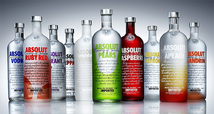
- The current Absolut Vodka design was created by TBWA and uses what appears to be a bold sans-serif while the rest of the copy is in dark cursive figures, which really draws the eye to "Absolut" which is color coded for flavor
- Adidas has a nice lowercase sans-serif in all black which ties the whole thing together. The triangle-like logo represents a mountain and the rugged, adventurous life that Adidas encourages.
- Campell's has a sloped sans-serif which has been a part of the long running tradition of soup that has established it as an icon everyone recognizes.
So it appears that it may be a bit more popular to currently use sans-serif fonts that call attention to their names. Older designs, such as cursive like figure or serif fonts seem to be related to products that have been around for a longer period of time and have history to their name.
No comments:
Post a Comment